Bookera Branding Inspiration LookBoard
|
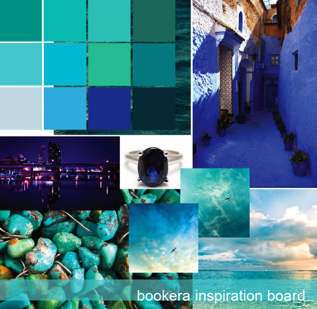
Commissioned to work on the logo for an up and coming start-up based in SF, that will change the way you access ebooks. We wanted to make sure we honed in on the right vibe. Therefore, we created two different inspiration color boards to make sure we shared the same vision as the client – and vice versa. They ended up choosing the green palette! Which one would you have chosen?
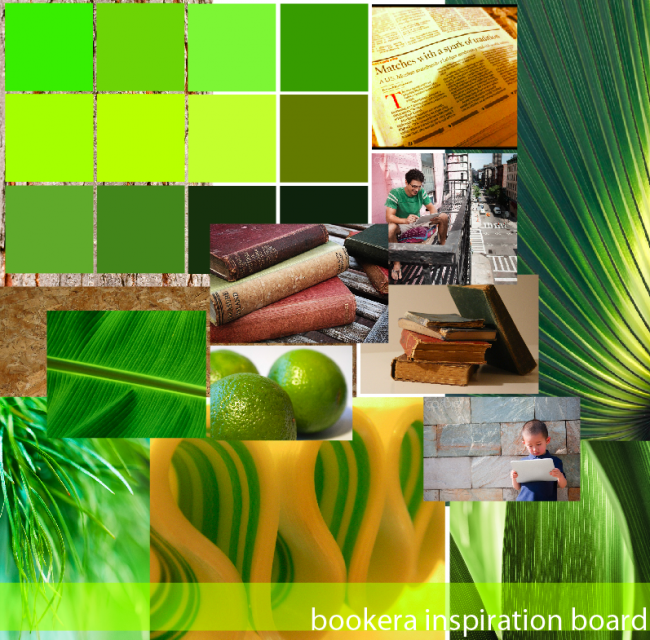
The Green+ Natural Palette:
Inspired by Grass, Exotic Leaves, Limes, Recycled Newspaper, Vintage Books, and Tree Bark. The idea is to channel natural elements that harmoniously bridge our familiar natural environments, with our urban city lifestyle environment. The eco-friendly palette reminds us of our connection to nature in our digital age – preserving our trees and forgoing paper and print. Embracing our surroundings whilst embracing ebooks at our fingertips. Literally. The idea of letting you unplug/plug-in with the natural world and the digital one simultaneously.
|


