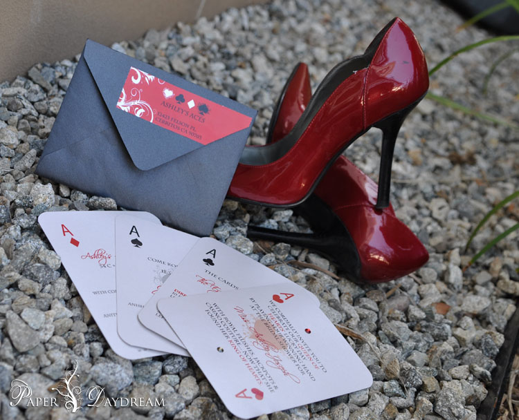
Casino Couture | Ashley’s Bridal Shower
Imagine a female version of Ocean’s 11– Seriously. A Team of 11 of Ashley’s Ace’s forwent planning a casino robbery in lieu of planning a casino shower. The end result: A lil’ Casino Royale, a lil’ Romance, and a lot
Casino Couture | Ashley’s Bridal Shower
Imagine a female version of Ocean’s 11– Seriously. A Team of 11 of Ashley’s Ace’s forwent planning a casino robbery in lieu of planning a casino shower. The end result: A lil’ Casino Royale, a lil’ Romance, and a lot
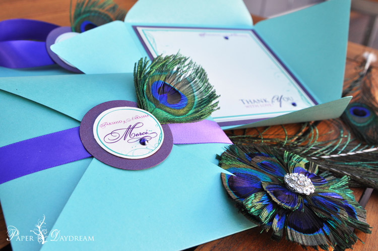
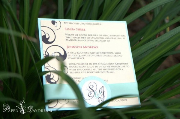
Mercy, Merci Me | Farshid & Natasha { Real Wedding }
When Dr. Farshid Kazi, MD {Yep the MD is official, he’s got his on-call pager and intern minions to prove it} told us he was getting married, we laughed for a good minute. Then we realized he was serious. Wait,
Mercy, Merci Me | Farshid & Natasha { Real Wedding }
When Dr. Farshid Kazi, MD {Yep the MD is official, he’s got his on-call pager and intern minions to prove it} told us he was getting married, we laughed for a good minute. Then we realized he was serious. Wait,
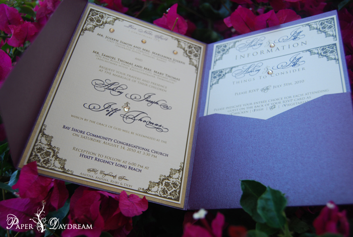
Love & Basketball : Ashley & Jeff
I love working on my close friends weddings, because all the time and energy I put into it, is manifested with a little more heart and soul. When my college roommate and BFF, Ashley told me she is not passionate
Love & Basketball : Ashley & Jeff
I love working on my close friends weddings, because all the time and energy I put into it, is manifested with a little more heart and soul. When my college roommate and BFF, Ashley told me she is not passionate
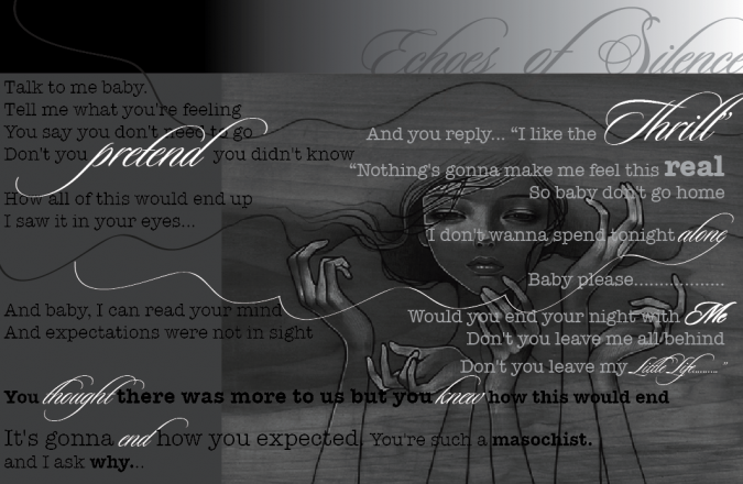
Echoes of Silence
When I can’t sleep and I have songs on repeat….emo art usually results. This song is beautiful, and The Weeknd’s voice is so mesmerizing…and addictive. The Weeknd – Echoes Of Silence by The_Weeknd
Echoes of Silence
When I can’t sleep and I have songs on repeat….emo art usually results. This song is beautiful, and The Weeknd’s voice is so mesmerizing…and addictive. The Weeknd – Echoes Of Silence by The_Weeknd

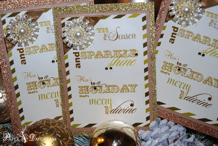
Sparkle & Shine
I may not celebrate Christmas, but I love, love celebrating the season. From the really over the top decor, the wintery warmth, the limited edition holiday drinks and food, to the cheesy music — and of course, all of the
Sparkle & Shine
I may not celebrate Christmas, but I love, love celebrating the season. From the really over the top decor, the wintery warmth, the limited edition holiday drinks and food, to the cheesy music — and of course, all of the
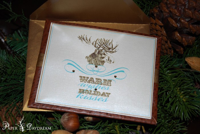
Cozy Cabin Christmas
So his name may not be Rudolf…and he may not have a red nose, and more importantly, he’s not even a reindeer. All the while, I still want you to feel like you have a piece of a cozy Christmas
Cozy Cabin Christmas
So his name may not be Rudolf…and he may not have a red nose, and more importantly, he’s not even a reindeer. All the while, I still want you to feel like you have a piece of a cozy Christmas
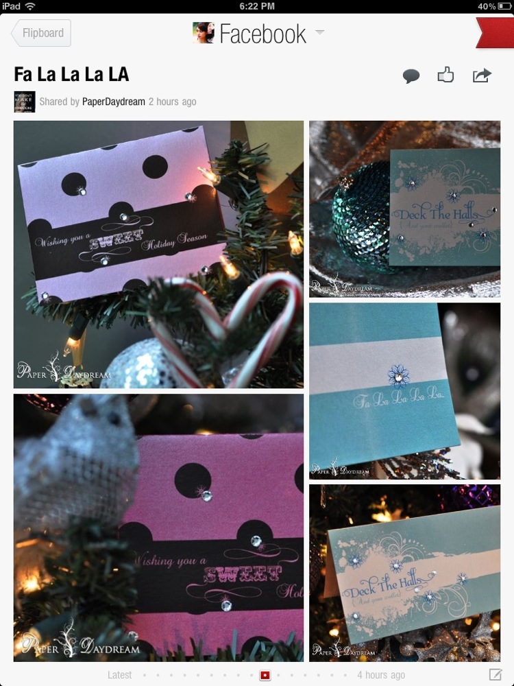
Fa La La La La
I love Flipboard’s magical curation style.
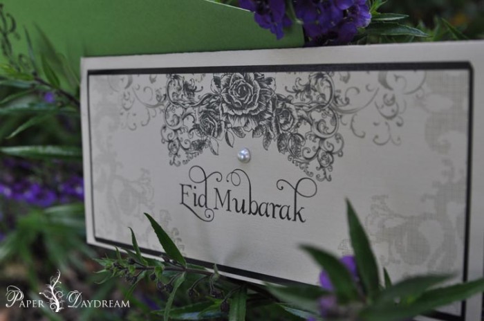
The Best Eidi Ever.
How freaking adorable is Baby Saif?! I have yet to meet this adorable bundle of joy, but just one look at this face, and I’m in love. We just received this photo of him posing with his Eidi money and
The Best Eidi Ever.
How freaking adorable is Baby Saif?! I have yet to meet this adorable bundle of joy, but just one look at this face, and I’m in love. We just received this photo of him posing with his Eidi money and


Magic Potion No. 5
Our True Blood…I mean Red Wine Bottle Labels. Happy Halloween kids. blood & kisses, PD
Magic Potion No. 5
Our True Blood…I mean Red Wine Bottle Labels. Happy Halloween kids. blood & kisses, PD

Let There Be Light
Happy Diwali for those observing this holiday — celebrating the festival of lights! Check out my article last year on Louis Vuitton + Diwali here. xo, PD
Let There Be Light
Happy Diwali for those observing this holiday — celebrating the festival of lights! Check out my article last year on Louis Vuitton + Diwali here. xo, PD

Blush Pink + Peach Pleasure Color Inspiration
We’re currently working on the look and scheme for a couple’s upcoming engagement party! The bride-to-be wanted a very light pink, so we came up with a ombre palette that incorporates our version of ‘light’…it’s perfect for the blushing bride-to-be.
Blush Pink + Peach Pleasure Color Inspiration
We’re currently working on the look and scheme for a couple’s upcoming engagement party! The bride-to-be wanted a very light pink, so we came up with a ombre palette that incorporates our version of ‘light’…it’s perfect for the blushing bride-to-be.

Golden Opportunity Inspiration Board | Fall 2011
Golden Opportunities Style Guide


