couture cards
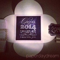
Happy New You! Hello, 2014
Cheers to 2014! Happy New Year, and Everything in between. Happy New You. xo.
Happy New You! Hello, 2014
Cheers to 2014! Happy New Year, and Everything in between. Happy New You. xo.
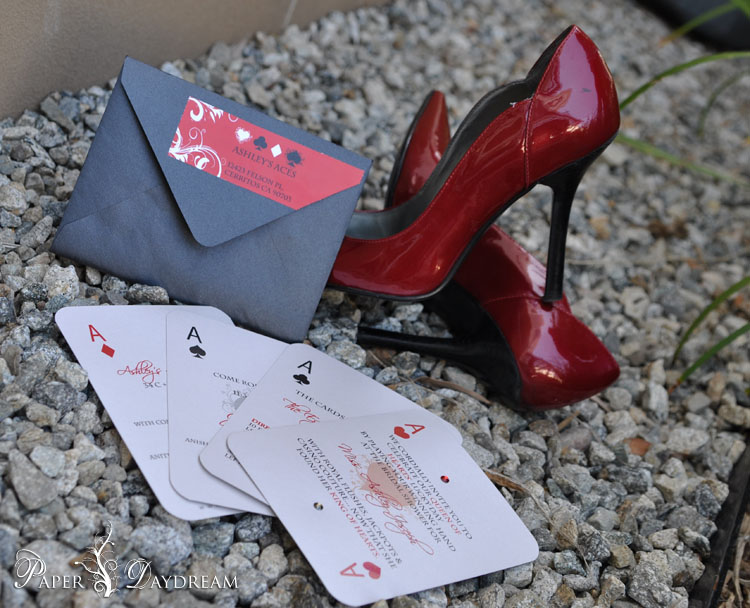
Casino Couture | Ashley’s Bridal Shower
Imagine a female version of Ocean’s 11– Seriously. A Team of 11 of Ashley’s Ace’s forwent planning a casino robbery in lieu of planning a casino shower. The end result: A lil’ Casino Royale, a lil’ Romance, and a lot
Casino Couture | Ashley’s Bridal Shower
Imagine a female version of Ocean’s 11– Seriously. A Team of 11 of Ashley’s Ace’s forwent planning a casino robbery in lieu of planning a casino shower. The end result: A lil’ Casino Royale, a lil’ Romance, and a lot
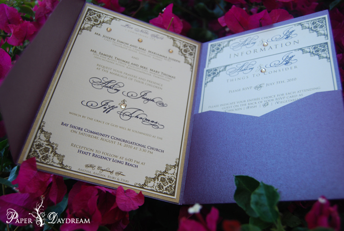
Love & Basketball : Ashley & Jeff
I love working on my close friends weddings, because all the time and energy I put into it, is manifested with a little more heart and soul. When my college roommate and BFF, Ashley told me she is not passionate
Love & Basketball : Ashley & Jeff
I love working on my close friends weddings, because all the time and energy I put into it, is manifested with a little more heart and soul. When my college roommate and BFF, Ashley told me she is not passionate
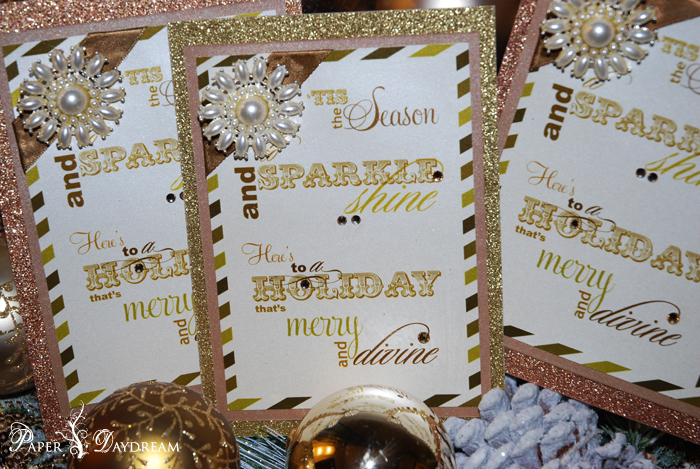
Sparkle & Shine
I may not celebrate Christmas, but I love, love celebrating the season. From the really over the top decor, the wintery warmth, the limited edition holiday drinks and food, to the cheesy music — and of course, all of the
Sparkle & Shine
I may not celebrate Christmas, but I love, love celebrating the season. From the really over the top decor, the wintery warmth, the limited edition holiday drinks and food, to the cheesy music — and of course, all of the
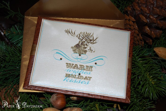
Cozy Cabin Christmas
So his name may not be Rudolf…and he may not have a red nose, and more importantly, he’s not even a reindeer. All the while, I still want you to feel like you have a piece of a cozy Christmas
Cozy Cabin Christmas
So his name may not be Rudolf…and he may not have a red nose, and more importantly, he’s not even a reindeer. All the while, I still want you to feel like you have a piece of a cozy Christmas

Let There Be Light
Happy Diwali for those observing this holiday — celebrating the festival of lights! Check out my article last year on Louis Vuitton + Diwali here. xo, PD
Let There Be Light
Happy Diwali for those observing this holiday — celebrating the festival of lights! Check out my article last year on Louis Vuitton + Diwali here. xo, PD
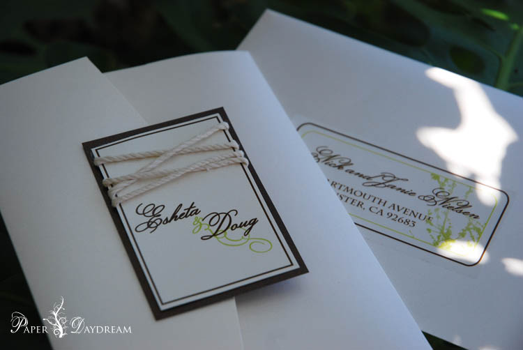
Eco-Chic Sustainable Love :: Esheta & Doug
When we met with the bride and groom to design their wedding invitations, we immediately understood the ‘look’ they wanted. Understated organic luxury, with a very specific color palette chosen by the bride. To go that extra mile and embody
Eco-Chic Sustainable Love :: Esheta & Doug
When we met with the bride and groom to design their wedding invitations, we immediately understood the ‘look’ they wanted. Understated organic luxury, with a very specific color palette chosen by the bride. To go that extra mile and embody

For Dad’s that support Daydreaming
My daddy supports my daydreams and helps me materialize them. He rocks sweater vests, and has an unlimited supply of argyle socks. He’s patient, wise, and always optimistic. No words, monetary value, or more socks, can ever express how grateful,
For Dad’s that support Daydreaming
My daddy supports my daydreams and helps me materialize them. He rocks sweater vests, and has an unlimited supply of argyle socks. He’s patient, wise, and always optimistic. No words, monetary value, or more socks, can ever express how grateful,

Love: In Translation | Alina & Yasir {Real Wedding}
Still can’t get over how gorgeous the bride, Alina looked on her wedding day! Not only did she beam with an inexplicable radiance, but every detail of her event looked radiant as well. It’s not a easy feat to make
Love: In Translation | Alina & Yasir {Real Wedding}
Still can’t get over how gorgeous the bride, Alina looked on her wedding day! Not only did she beam with an inexplicable radiance, but every detail of her event looked radiant as well. It’s not a easy feat to make
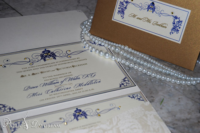
The Royal Treatment
With all the fervor and media coverage of the Royal Wedding, we’d be remiss to not make any mention of this auspicious occasion. It’s lovely that it’s a love story, and not just a forced courtship between two royal families.
The Royal Treatment
With all the fervor and media coverage of the Royal Wedding, we’d be remiss to not make any mention of this auspicious occasion. It’s lovely that it’s a love story, and not just a forced courtship between two royal families.

Pushing The Envelope | Serene’s Welcome Home Baby Shower
Special Delivery! Saman, owner of 2Create Designs was having her first born baby girl! It’s only fitting that Baby Serene is welcomed into the world in 2Create Design Studio style. A Baby Bling Soiree for the lovely little princess! So
Pushing The Envelope | Serene’s Welcome Home Baby Shower
Special Delivery! Saman, owner of 2Create Designs was having her first born baby girl! It’s only fitting that Baby Serene is welcomed into the world in 2Create Design Studio style. A Baby Bling Soiree for the lovely little princess! So
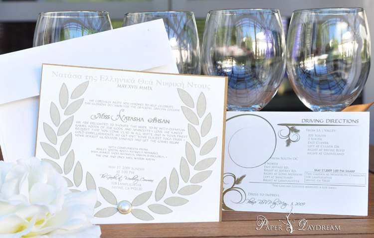
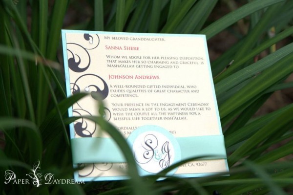
Natasha’s Grecian Goddess Bridal Shower
Perhaps it was divine intervention, or just a gift from the gods – but what ever the case, Miss Natasha was well deserving of this Greek Goddess {All White & Gold Err-thing} Bridal Shower. A Bridal Shower that came straight
Natasha’s Grecian Goddess Bridal Shower
Perhaps it was divine intervention, or just a gift from the gods – but what ever the case, Miss Natasha was well deserving of this Greek Goddess {All White & Gold Err-thing} Bridal Shower. A Bridal Shower that came straight
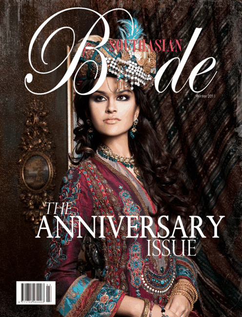
PaperDaydream Featured in South Asian Bride Magazine | Winter 2011
We are SO excited to be featured in the Winter 2011 Anniversary Edition of South Asian Bride Magazine! We teamed up with the creative forces behind 2Create Design Studio to create this Winter Wonderland Luxe tablescape. We designed the full
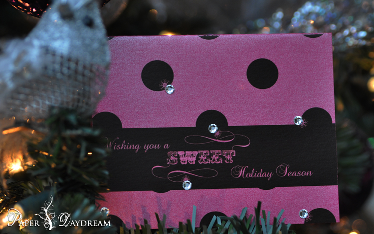
‘Tis The Season…To Be Sweet.
And Oh, what a season it is! Making spirits bright everywhere – adding a little sweetness to someone’s day just got easier. These not-so-traditional rose pink and fuschia polka-dot Holiday cards were inspired by the packaging we created for Rubina’s
‘Tis The Season…To Be Sweet.
And Oh, what a season it is! Making spirits bright everywhere – adding a little sweetness to someone’s day just got easier. These not-so-traditional rose pink and fuschia polka-dot Holiday cards were inspired by the packaging we created for Rubina’s


